9. GUI Guide
The following shows a common guide for the RAFCON-GUI. The page contains advises about how to use the widgets effectively.
9.1. Left Pane
Library Tree widget
The Library tree shows all libraries mounted via the LIBRARY_PATH defined in your configuration file, see Configuration. Sub-library paths unfold and fold by double-click. Double-clicking on a library opens the library in the graphical editor. A right-click on the row of a library element opens a menu with the options “Add as Library”, “Add as template”, “Open” and “Open and run”. “Add as template” pastes a fully editable copy of the respective library into the actual selected state (as long as selected state is a ContainerState).
The Library Tree can be reloaded by pressing the the “Refresh Libraries”-Button in the Menu-Bar or Tool-Bar.
State Machine Tree widget
The State Machine Tree (or “State Tree”) shows all states that are in the actual selected state-machine, its state_id and the type of the state. A state is selected if the respective row is selected and the row of a state becomes selected if the state becomes selected by another widget e.g. the graphical editor. A selected state can be removed by pressing the delete-shortcut or a state can be added into a selected state/row by pressing the add-shortcut. See Configuration to define those shortcuts.
Global Variable Manager widget
The Global Variable Widget shows all existing global variables, their names, values and if they are locked. The name and value can be edited by clicking into the respective fields and “shift-tab”, “tab”, and the “arrow-keys” can be used to move throw the editable columns and variables. Press Enter or move by using “shift-tab” or “tab” to confirm the modification of a specific element. A selected global variable can be removed by pressing the delete-shortcut or a variable can be added by pressing the add-shortcut. See Configuration to define those shortcuts.
Modification History widget
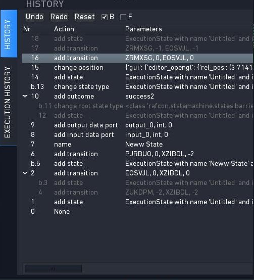
The history is implemented as a tree of actions. Therefore a trail history view (list) and a branch history view (tree) are possible. The actual used representation is the branch history view, see figure.
In the top (below the label “HISTORY”) the edit history widget has three buttons for “Undo/Redo” of actions and “Reset” of the history. The reset deletes all history tree elements recorded so far. “Undo” and “Redo” also can be performed by using the shortcuts strg-z and strg-y as usual.
The view also can be modified by the disabling of the branch-history view (trail-history-view becomes active) using the check-button labeled “B” or by only enabling automatic folding of the not used branches by check-button “F”.
In the figure it can be seen that the trail history element with number 16 is selected (grey). Every number/id is one step of the state machine edit process that has been recorded. Action with the number 16 used the method “add transition” and connects two states with the IDs ZRMXSG and EOSVJL. Elements 17-18 are undone and thereby are labeled gray. All elements in the trail history from 0 to 16 are in use, so labeled white. All elements on a previous used branch but not active branch are also labeled grey, see Nr 11-12 and 3-4.
By selecting a specific element in the list/tree the version after this action is recovered. To jump to the initial situation of the state machine when the record of edit history started the user has to click element 0 which is labeled by action “None”.
Execution History widget
In the execution history widget all runs of the currently selected state machine are visualized in a tree like structure. This can be used for debugging purposes as also all the context data of each executed state is visualized. The execution history can also be logged to disk. (see the logging variables in the Core Configuration)
9.2. Center Pane
Graphical State Machine Editor widget
There are two different graphical editors for editing a state machine. The current graphical editor uses the Python library “Gaphas”. The alternative graphical editor uses OpenGL for hardware acceleration with the graphics card. The Configuration explains how to switch between the two editors.
The Gaphas graphical editor is more advanced than the OpenGL one (and also much more pleasant to look at ;-) ). There are some shortcuts, which you should be aware of:
Zoom: Mouse scroll wheel
Panning: Middle mouse button
Move ports (along border of state): Ctrl + click and move cursor (select the state of the port beforehand)
Move name of state: Ctrl + click and move cursor
Resize state with content: Ctrl + click on corner handles
Operations on the selected state: Right mouse button (opens context menu)
Add new Execution State to selected state: Alt + E
Add new Hierarchy State to selected state: Alt + H, Ctrl + Shift + A
You can also drag’n’drop states into the editor. This is possible from the four “+ *S” buttons below the editor and from the libraries widget.
Debug Console widget
The Debug Console can be found below the Graphical Editor. All messages
will be displayed in it, whereas the type of the displayed messages can
be filtered with the checkboxes on top of the console. As for the other
widgets, the Debug Console can be unpinned by clicking the symbol in
the upper right corner. A right-click into the console opens a menu
providing the options to "Copy" selected output, "Select All"
output or "Clear Logging View".
9.3. Right Pane (States Editor)
The right sidebar shows the “States Editor”. It can show several tabs, but by default, only the selected state is shown. However, you can pin a state tab by clicking on the needle icon within the tab.
The number within the tab shows the state machine id belonging to the state.
Every “State Editor” consists of the three widgets described below: The State Overview, State content (with widgets for the Source Editor, Logical Linkage and Data Linkage) and State Linkage Overview (with widgets for the Description and Semantic Data).
State Overview widget
The State Overview can be found directly under the “STATE EDITOR” headline. It provides the name of the selected state, which can be edited by clicking on it, and the fixed state ID. Additionally, the State Overview contains a dropdown menu, where the type of the state can be changed, and a checkbox which marks a state as start state.
Source Editor widget
The Source Editor is the first tab of the notebook in the middle. It is a editor with the three buttons “Apply” to save the file, “Cancel” to discard changes and “Open externally” to open the file in an external editor.
Logical Linkage widget
By clicking the middle tab of the center notebook, the sub-widgets Outcomes and Transitions, which represent the logical linkage of a state, can be reached. In the Outcomes widget the outcomes of the selected state are listed. It consists of the columns “ID”, “Name” and “To-State”. If the “To-State” is a hierarchy state the “To-Outcome” of the “To-State” is also shown. Next to the obligatory IDs “0”, “-1” and “-2”, it is possible to append own outcomes by clicking the “Add” button. A click on the “Remove” button will delete the selected outcome.
The Transitions sub-widget lists the transitions between the selected state and its siblings (or parent). There are the four columns: “Source State”, “Source Outcome”, “Target State” and “Target Outcome”. With the buttons “Add” and “Remove”, additional transitions can be added and selected ones can be deleted.
Data Linkage widget
The Data Ports and Data Flows sub-widgets, which represent the data linkage of a state, can be accessed by clicking oon the last tab of the middle notebook. Within the Data Ports sub-widget it is possible to change between “Input Ports” and “Output Ports”. The currently selected one is highlighted in blue. Input and output ports works like function parameters. They consists of a “Name”, a “Data Type” and a “Default Value”. A click on the button “New” appends a new port, the button “Delete” removes the selected port. If the selected state is a container state, then also a tab for “Scoped Variable” emerges.
Similar to the transitions, the data flows of a state are shown in the lower part.
Data and Logical Linkage widget
A quick overview of all data ports and outcomes of the selected state.
State Description widget
The State Description sub-widget can be reached by clicking the second tab of the lower notebook. It is an editor, where comments or a description can be placed.
Semantic Editor widget
In this widget the semantic data of a state is shown and can be edited in a tree like data structure.